GEO report: Share of Voice
The Share of Voice tab compares how much of the modeled conversation your brand earns versus named competitors in the same test answers: headline cards (Strict SOV, Query Coverage, competitor count, market leader), mention counts and share table, market-share pie, SOV trend when history exists, and the prompt list that fed the run. Each block below matches the Share of Voice tab in the live report. Place PNG files under public/images/docs/ using the screenshot keys; until then the docs UI shows a placeholder.
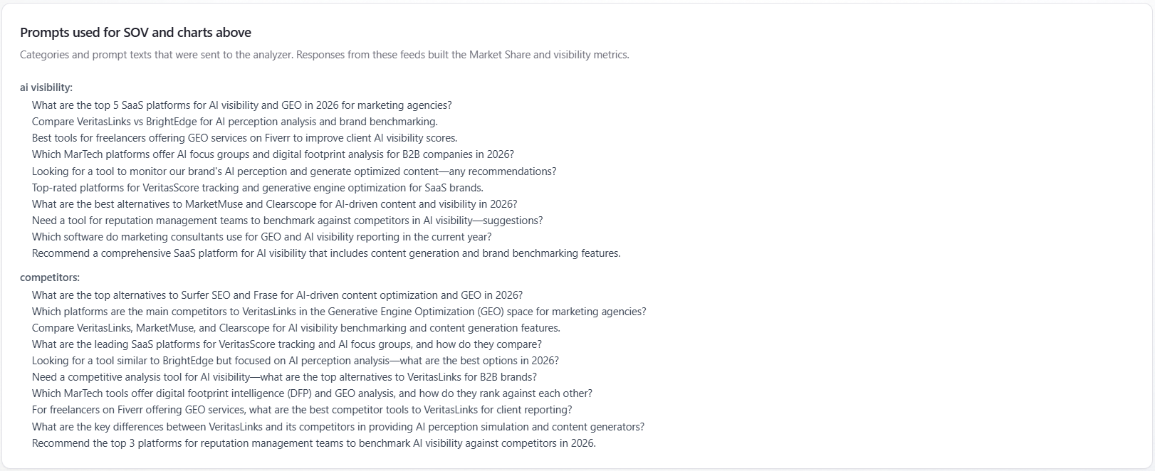
Strict SOV
What it is: the percentage of test answers (one row per prompt and model) where your per-answer modeled visibility strength is at least 75% on the 0–100 scale. Only answers with a usable strength score count; if none qualify, the card falls back to Query Coverage.
How to read it: this is stricter than Query Coverage (which only asks whether you count as mentioned). High Strict SOV means you do not only appear—you appear with strong modeled strength. Pair with Query Coverage: a large gap means many weak mentions.
Query Coverage
What it is: the same percentage as on Overview and AI Visibility—the share of test answers where your brand counts as mentioned. The product prefers all-models totals when the report includes them; otherwise it counts mentioned rows in the answer grid. The SOV card subtext refers to how “mentioned” is determined in the pipeline; the browser does not apply its own cutoff.
How to read it: compare to Strict SOV and mention rate in the Mentions section. Same number as the other tabs for this run—use one doc to avoid contradicting yourself: GEO report: AI Visibility — Query Coverage, and Overview tab — Query Coverage context.
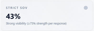
Competitors Found
What it is: how many direct competitors the analysis identified for this report after combining results across assistants when more than one model is in the run.
How to read it: a sanity check for how crowded the narrative is. Cross-check the Competitors tab and the Brand / competitor table below—names should line up. Zero can mean no competitor rows were returned for this run.
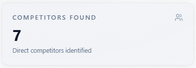
Market Leader
What it is: the name of the competitor with the highest modeled share of voice after the list is merged and sorted. With a single assistant in the run, ordering follows whatever the analysis returned unless it is already sorted by share.
How to read it: treat as the leading rival by modeled share in this slice, not as external market research. Compare to the pie chart and Brand / competitor table.
Section: Mentions — you vs competitors
What it is: a card with subtitle “Total mentions across all models (prompt × model responses). Share % = share of all mentions.” The three summary tiles and the table below use overview totals when the report provides them; otherwise they are computed from the per-answer grid.
How to read the section: start with the three indicators, then the table—counts are raw mention tallies for this run; share % is relative to the competitive mention mix shown.
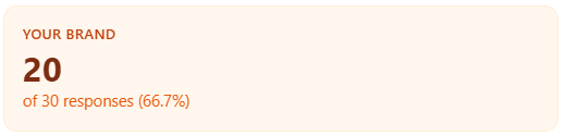
Your brand
What it is: total mentions of your brand, with subtext tying the count to overall responses and your mention rate percentage.
How to read it: your raw volume in the test matrix. Compare to Total responses to see saturation; compare to competitors in the table for share.
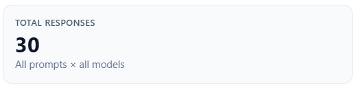
Total responses
What it is: all prompt × model answer rows in scope for the overview block (label: “All prompts × all models”).
How to read it: the denominator for mention rate; use it to judge whether the sample size is large enough to trust percentages.
Mention rate
What it is: the percentage of responses where your brand was mentioned (same basis as the “of N responses” line under Your brand).
How to read it: pair with Query Coverage (same conceptual “mentioned” story, different aggregation path in edge cases). If rate and coverage diverge slightly, rely on the doc for Query Coverage for the headline coverage definition.
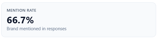
Table: Brand / competitor
What it is: your brand row (mention count and share), then one row per competitor with mention counts and share of voice to one decimal place.
How to read it: sort priorities by share and raw mentions—who is eating the conversation. Verify surprising names in the Competitors tab and Mentions.
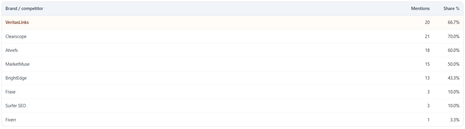
Chart: Market Share Distribution
What it is: a pie chart where slices use your brand’s share of voice and each competitor’s share, labeled by name. The card states that slices reflect share of the modeled conversation for this run. When answer rows exist, a helper table may list up to 12 prompts with “mentioned/total models” per prompt.
How to read it: visual split of competitive share—use next to the stat cards and table. The per-prompt mini-table explains how often you were mentioned across models for sample prompts, not a second SOV definition.
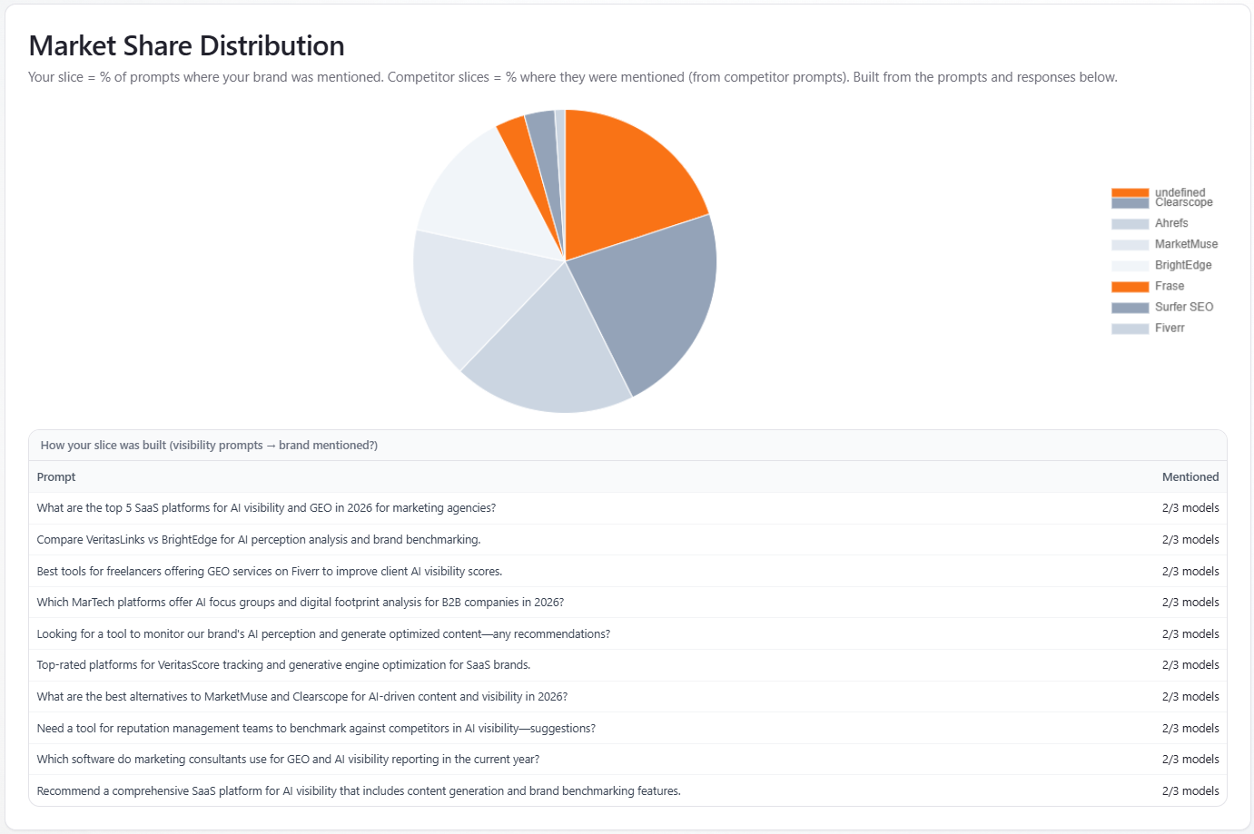
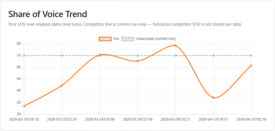
Chart: Share of Voice Trend
What it is: when history includes at least two dated points, a line chart plots your share of voice over analysis dates. A dashed line shows the top competitor’s SOV from the current run only—flat across dates because past competitor SOV by date is not stored (see in-app copy). With fewer than two points, you see an empty state with current-run SOV and subscription messaging.
How to read it: trust the orange “You” line for trajectory; treat the dashed competitor line as contextual for the latest run, not a historical competitor trend.
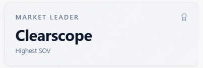
Prompts used for SOV and charts above
What it is: prompts grouped by category (category labels shown with spaces instead of underscores). When a model filter is selected, only prompts for that assistant appear. Up to 15 unique prompt texts per category are listed, with “+N more” when needed. The card states these prompts fed the analyzer and the market share / visibility metrics above.
How to read it: coverage audit—thin categories mean under-sampling for that theme; expand prompts and re-run to stabilize SOV and charts.