GEO report: Competitors
The Competitors tab combines GEO competitor intelligence (same answers and competitor sections as other tabs) with optional data from a linked AI Focus Group session that runs after GEO in automated pipelines. When a Focus Group completes, outputs such as simulated brand choice are merged into the GEO report so you see GEO analytics and blind persona votes in one place. Place PNG screenshots under public/images/docs/ using the keys below.
GEO vs Focus Group: what loads where
From GEO analysis: competitive rows (SOV, sentiment, E-E-A-T-style scores), optional competitor discovery, ranking-factor and content-type charts or fallbacks, SWOT and recommendations keyed by competitor, suggested actions, and content-gap lists—whatever this run produced in the competitors and recommendations parts of the report.
From the latest completed Focus Group linked to this GEO analysis: overall choice probabilities, per-round averages, vote counts, and persona-level choices. The app shows these as the horizontal bar (all options) and, when you open a competitor, per-round charts and a link to the full Focus Group report.
Competitor Discovery (optional)
When competitor discovery data is present, a table lists names found by analysis agents, mention counts, which analyzers surfaced them, and a short sample context. Rows not in your configured competitor list may show a “From AI” badge—use for landscape mapping, not as a final CRM list.
How to use: triage unexpected names in Mentions Explorer; add real competitors to your next run if they matter.
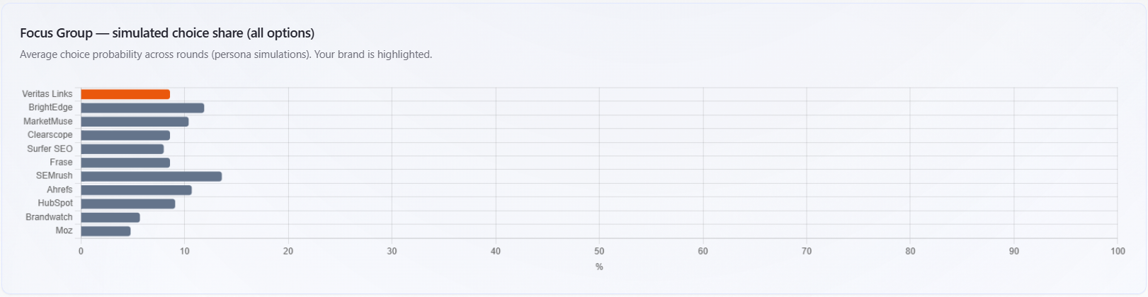
Focus Group — simulated choice share (all options)
Rendered when a linked Focus Group session supplied competitor-choice metrics. The chart is a horizontal bar of average choice probability per brand option (0–100%). Your brand is highlighted in orange; other options in gray.
What it is for: a single-glance distribution of simulated preference across every brand in the Focus Group choice set—not search traffic or revenue. It answers: if personas had to pick one brand under the session design, how often does each win on average?
How to read it: compare your bar to the pack; wide gaps suggest a strong perceived leader in the simulation. Combine with per-competitor round charts below for why opinions shift across rounds. Open the linked Focus Group report for full transcripts.
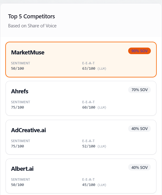
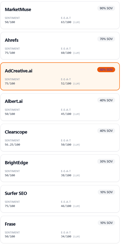
Top 5 Competitors (list) and free vs paid comparison
The left column lists the competitive analysis for this view, merged across assistants when applicable. Each card shows name, SOV %, Sentiment (0–100), and E-E-A-T (LLM) (0–100). Cards are ordered by modeled share.
Free or funnel reports: you may still see several competitors with SOV, but deep recommendations (SWOT depth, content gaps, volume of suggested actions) are limited as described in the in-app notice—often one primary rival for full depth, with more on paid plans. The app usually starts with the first row (highest share) as the active comparison. Paid or full reports: click another competitor to switch; the detail panel (Focus Group slice, SWOT, radar, actions, gaps) follows the selected rival.
How to use: pick the rival you care about (or the default top share); everything below compares that choice to your brand.
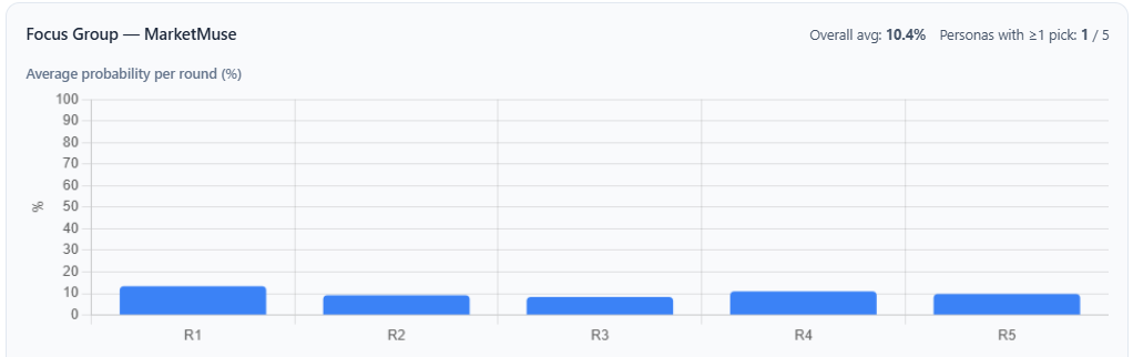
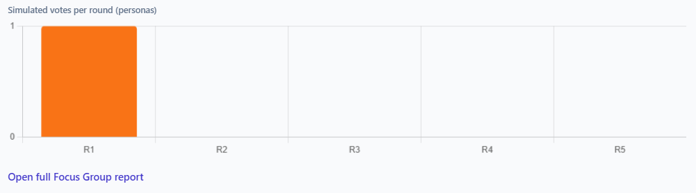
[Competitor] Analysis — header and Focus Group round charts
After selection, the header shows the competitor name, optional positioning line, and badges for average position and visibility percentage from that row.
When Focus Group choice data exists, a Focus Group block for that competitor shows overall average probability, how many personas picked this brand at least once versus total personas, then two charts:
- Average probability per round (%) — for each discussion round, the average simulated probability for this competitor. Shows how opinion moves round to round.
- Simulated votes per round (personas) — discrete vote counts for this competitor per round (counts, not percentages).
If per-round data is empty, you may see “No per-round data.” If choice data is missing for an older session, an amber box may warn that the report is outdated. A link opens the full Focus Group report for that session.
How to read: use probability bars for stability or swings across rounds; use vote counts for how strongly personas committed in each round. Disagreement between this chart and GEO SOV is expected—simulated choice is not the same as mention share.
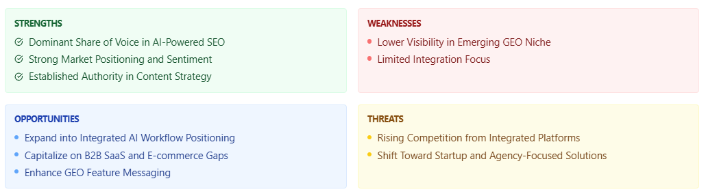
SWOT: Strengths, Weaknesses, Opportunities, Threats
One four-quadrant grid (green, red, blue, yellow) loaded from recommendations for the selected competitor when available. Items can be short lines or title-plus-detail entries. If only a single global SWOT block exists for the run, it can fill the grid when nothing else matches.
What it is for: a strategic summary produced by the recommendations step—use for workshops and planning, not as verified facts without checking sources.
How to read and use: strengths versus weaknesses inform messaging and product gaps; opportunities suggest campaigns and partnerships; threats inform risk monitoring. Validate important bullets against Mentions Explorer before large investments.
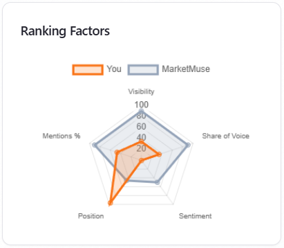
Radar: Ranking Factors
Compares your brand (orange) to the selected competitor (gray) on the same axes. The chart prefers server-provided ranking-factor series; if those are missing, the app derives approximate axes from visibility, share, sentiment, position, and mention patterns. The fallback comparison line may start from the top competitor by share.
When you switch competitors in the list, the gray trace updates from that competitor’s scores so the comparison always matches your selection. On limited plans the default rival is usually the first row (top share).
How to read: larger area on an axis means a stronger modeled signal on that factor within this report—not an industry certification. Look for axes where the competitor leads to decide what to fix first.
Content Types
Doughnut chart from the content-type distribution in the competitors section when present. If absent, the app approximates shares from how many prompts fall into each configured category.
How to read: shows where prompt volume sits by theme (for example visibility-style versus competitor-style)—see whether the run was balanced or skewed. It is not a media-mix recommendation by itself.
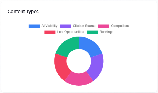
Table: Recommended Actions
Rows from recommended actions for the selected competitor when present, otherwise the report-level list. Each row shows focus, action, and status. On shared or limited views the block may be locked until the viewer has full access.
How to use: treat as a prioritized backlog for marketing and product; assign owners and tie items to a future GEO re-run or Focus Group.
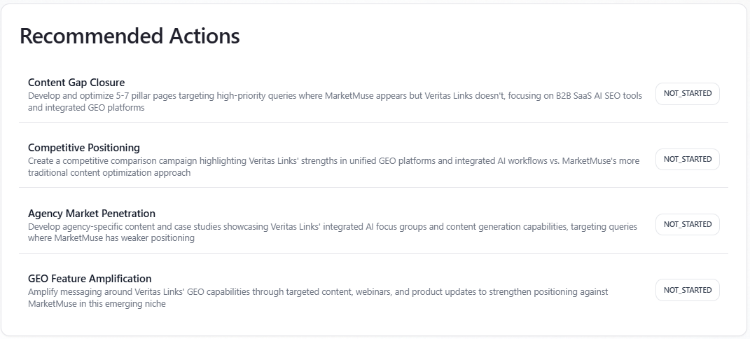
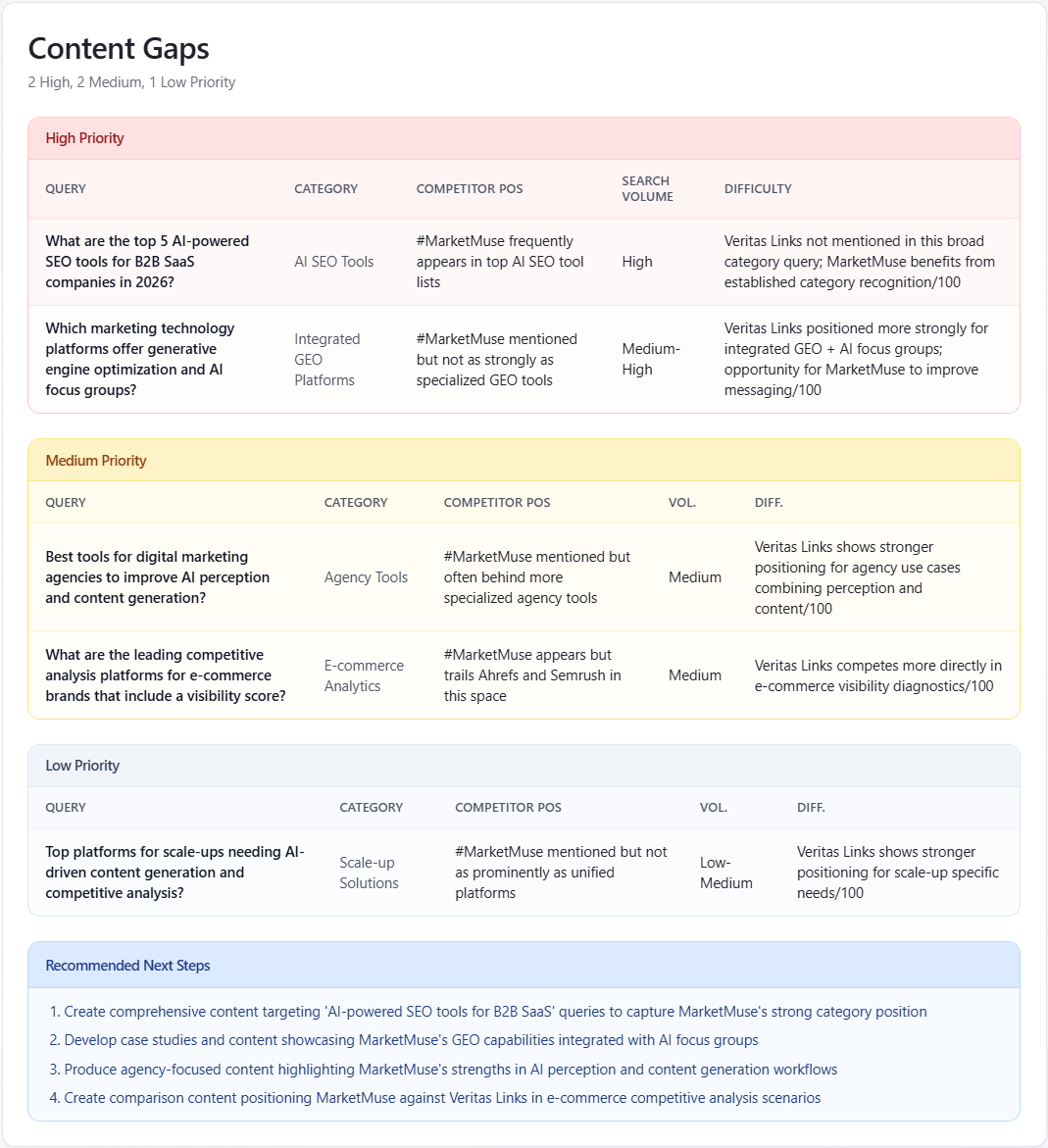
Table: Content Gaps
When structured gap objects exist for the competitor, the card shows High, Medium, and Low priority tables with columns such as Query, Category, competitor position, search volume, and difficulty (0–100). Recommended Next Steps lists numbered follow-ups.
Fallback: if only a simple gap list exists, a smaller table may appear. Empty gap sections may invite upgrading to see fuller multi-competitor analysis.
How to read: tackle High priority first—queries where the competitor leads and you are exposed; use difficulty and volume to sequence SEO and content work. Recommended Next Steps turns the tables into an ordered checklist.