GEO report: AI Visibility
This tab focuses on presence and coverage in modeled answers: headline strength (Total Visibility), share of responses where you count as mentioned (Query Coverage), history when dated runs exist, multi-model agreement, and prompt-level win/miss lists. Figures follow the same logic as the live report: the per-answer grid, overview totals, and dated trend rows when present.
Related pages
Total Visibility
What it is: the same headline visibility score as on Overview—average modeled strength (0–100%) across your prompt set for this report. On this tab it appears as a stat card and drives the “Current AI Visibility” donut (Visible vs Not Visible split uses that same percentage).
How to use with other metrics: compare to Query Coverage. High visibility with low coverage means strength is uneven—you are “loud” in some answers but absent in many rows. See the Overview tab doc for the dedicated screenshot and narrative.
Also documented here
Query Coverage
What it is: a percentage of test responses where your brand counts as mentioned. The product uses all-models mention and response totals when the report includes them; otherwise it counts mentioned rows in the answer grid (or falls back to overview totals). Each row is one assistant answer to one prompt—this percentage is not deduplicated by unique prompt.
How to interpret: this is not the same number as Total Visibility (which averages strength scores). You can have moderate average visibility but high coverage, or the reverse, depending on how often you appear versus how strongly. Other parts of the product describe “mentioned” with a strength rule in prose; each answer row is tagged by the analysis—this card does not invent its own cutoff.
How to use: pair with the “Where You Win / Where You’re Missing” lists and Mentions Explorer. If coverage is low, fix presence and prompts first; if coverage is high but sentiment or rank is weak, shift to proof and positioning.
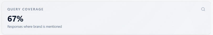
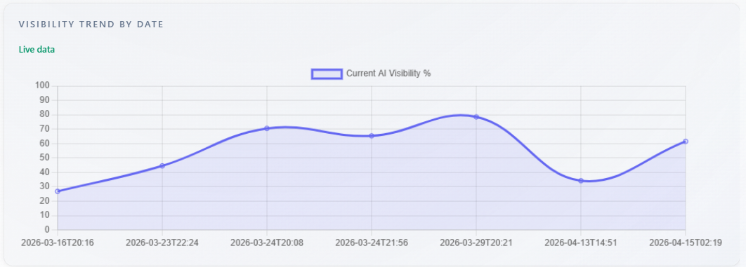
Chart: Visibility Trend by Date
What it is: a line chart of current AI visibility percentage over time. Data comes from historical points per analysis date in the report. With at least two points, you see a multi-point line and a “Live data” badge. With exactly one historical point, the chart shows a single-point display (no artificial line from zero). With no trend rows but a score in the current run, the chart may show one point from the current analysis date. Without a usable score, the chart is empty.
How to use: confirm you are comparing the same brand and comparable prompt sets across dates. Use direction after real changes (content, PR, product), not single-point noise.
Cross-Model Consistency
What it is: this block appears only when the report includes more than one assistant. The score is the percentage of unique prompts for which every assistant’s answer for that prompt mentions your brand. If any assistant fails to mention you on a prompt, that prompt fails. It is a strict “all assistants mentioned you here” measure, not an average of per-assistant rates.
How to use: low consistency with decent single-model visibility means assistants disagree—prioritize messaging and assets that work across engines. If you only have one model in the report (typical for free DeepSeek-only), this section is hidden.

Table: Where You Win
What it is: up to 10 prompts where you are mentioned and your rank is missing or in the top three. Prompts are deduplicated; when duplicates exist, the best (lowest) rank wins. Subtitle in the UI: “Queries with strong mention and position.”
How to use: treat these as themes to protect in copy and SEO—double down on what already works. Cross-check Mentions for verbatim context.
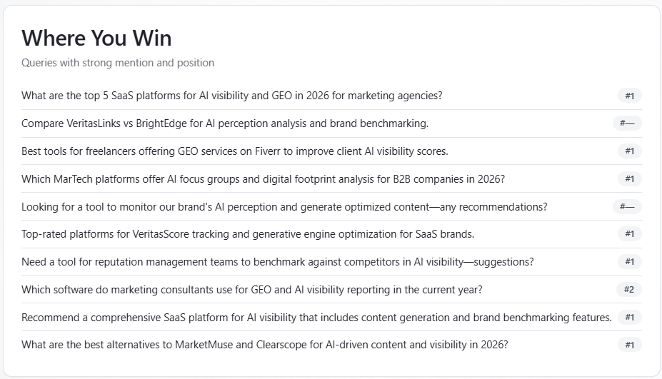
Table: Where You’re Missing
What it is: up to 10 prompts where you are not mentioned, deduplicated by prompt (first losing row kept). These are gaps in presence, not sentiment diagnosis by themselves.
How to use: prioritize content and positioning experiments for these queries; re-run after changes to see if they move into “Win” or into coverage.
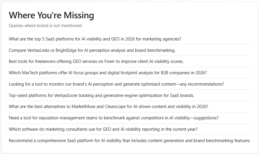
Table: Why Not Mentioned
What it is: a list where each item has a query string and a short reason you were not mentioned. Text is model-generated explanation, not a fixed business rule.
How to use: treat reasons as hypotheses for content and PR (category fit, trust, alternatives). Validate against Mentions and real customer interviews before large bets.
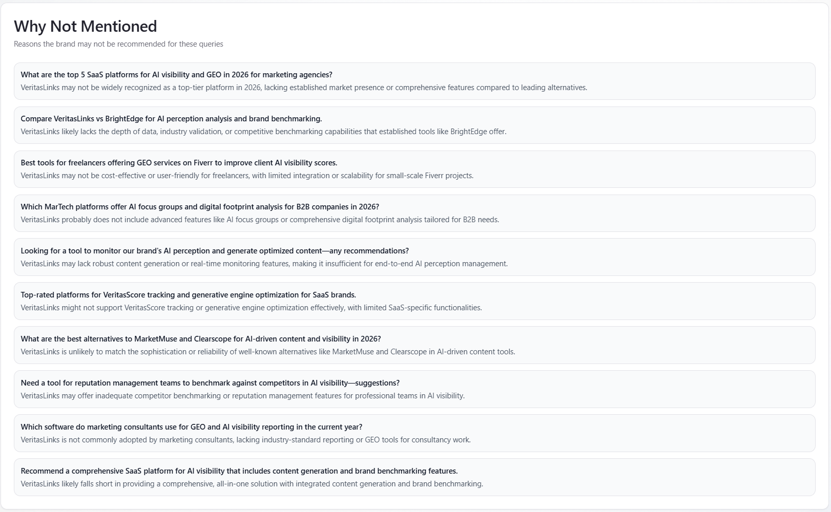
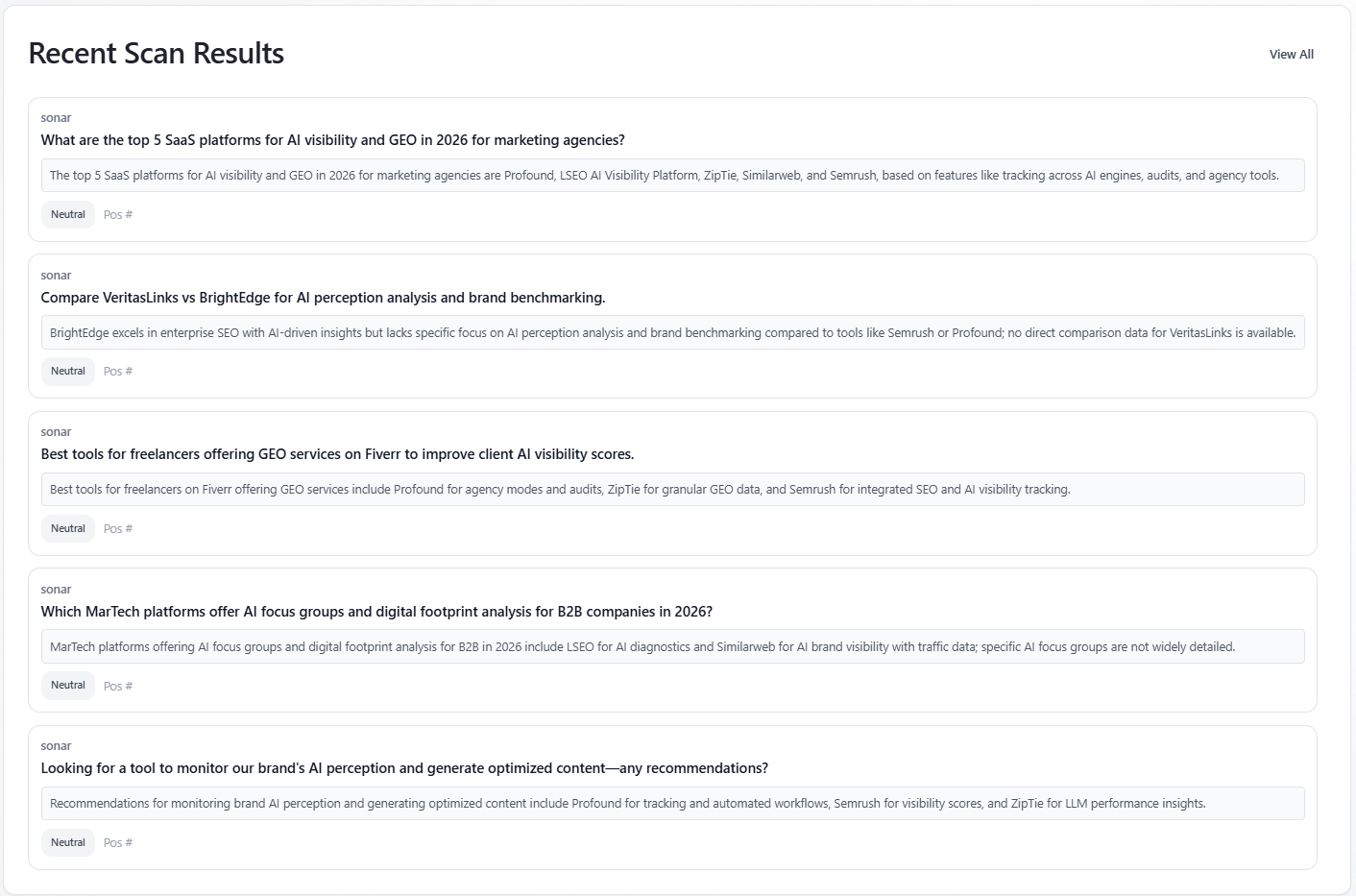
Table: Recent Scan Results
What it is: the first five mention rows with a non-empty preview. When a model filter is active, only that assistant’s rows appear. Each card shows model label, prompt text, a short preview, a sentiment badge (Positive / Neutral / Negative), and list position when present. “View All” switches to the Mentions Explorer tab.
How to use: quick qualitative spot-check before diving into Mentions; not a full history (five rows only).