GEO report: Overview tab — indicators & sections
This page matches each label on the Overview tab to a screenshot crop. Place PNG files under public/images/docs/ using the keys below; until then the docs UI shows a placeholder. Cross-read indicators: presence (visibility, mentions) must agree with tone (sentiment) and money story (revenue); competitive position (leader, position) must agree with Share of Voice and Competitors.
Engines, free vs paid
Total Visibility
What it is: average modeled strength (0–100%) that your brand appears in answers across your prompt set—the headline presence score.
How to use with other metrics: pair with Brand mention vs not and AI Visibility query coverage. If visibility is high but mention split is poor, your strength is uneven across prompts. If both are low, fix positioning and prompts before sentiment work.

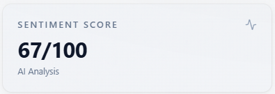
Sentiment Score
What it is: a 0–100 style roll-up of tone from sentiment labels (and numeric sentiment when the model returns it).
How to use with other metrics: read next to the Sentiment donut and Sentiment mix (brand). Neutral-heavy runs often sit near 50—use charts, not only the integer. Low score with high visibility means you are seen but not loved; high score with low visibility means tone is fine when you appear but presence is the bottleneck.
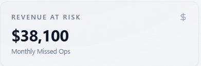
Revenue At Risk
What it is: a directional monthly “missed opportunity” figure from modeled visibility and inputs—not accounting data.
How to use with other metrics: ties to Report-level revenue capture rate and Revenue tab. Use to prioritize; validate with your funnel. If revenue at risk is high but visibility is already high, shift budget from awareness to conversion proof (E-E-A-T, objections).
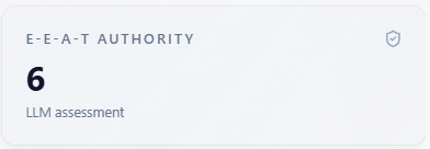
E-E-A-T Authority
What it is: how expert, experienced, authoritative, and trustworthy the model’s narrative makes you look.
How to use with other metrics: combine with Source Tracker quality scores and Sentiment. Low E-E-A-T with okay visibility means you are mentioned without credible framing—invest in citations, case studies, and third-party proof.
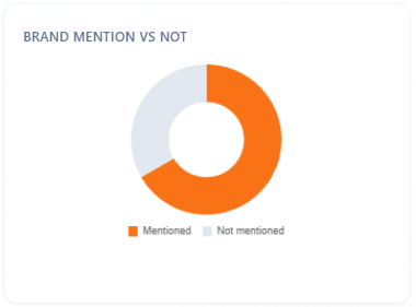
Brand mention vs not
What it is: share of responses (for All or the selected model) where your brand is mentioned versus not.
How to use with other metrics: the fastest check for “are we in the conversation at all?” Compare to Total Visibility and mention rate on AI Visibility. Fix mention gap first; only then optimize Sentiment mix.
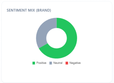
Sentiment mix (brand)
What it is: Positive / Neutral / Negative split for sentiment on brand mentions in the scoped rows.
How to use with other metrics: must align directionally with Sentiment Score and the large Sentiment section donut. If this mix is weak but headline sentiment looks fine, the gap is often scope—headline includes answers where you are absent.
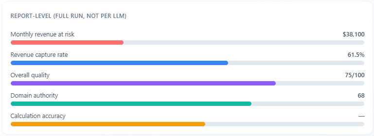
Report-level (full run, not per LLM)
What it is: report-wide bars for revenue at risk, revenue capture rate, overall source quality, domain authority, and calculation accuracy—labeled as the full run, not one LLM.
How to use with other metrics: anchors the whole job. Use capture rate and accuracy to judge how much to trust dollar estimates; compare quality and domain authority to E-E-A-T and Source Tracker. Per-model fights belong in the bars and KPI row, not here.
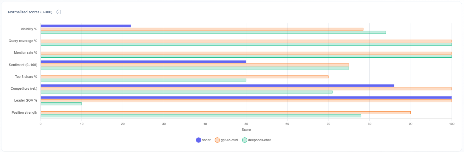
Multi-model normalized scores (horizontal bar chart)
What it is: Performance by LLM—each engine as a dataset on the same axes (visibility %, query coverage, mention rate, sentiment, top-3 share, competitors, leader SOV %, position strength).
How to use with other metrics: your first view of “do all assistants see us the same way?” If one model is an outlier, weight fixes toward that engine if your buyers use it. Shown when multi-model data is available (typically not on free DeepSeek-only).
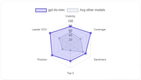
Selected model vs average of other models (radar)
What it is: radar comparing the selected model to the average of the others on Visibility, Coverage, Sentiment, Top-3, Position, Leader SOV.
How to use with other metrics: complements the bar chart with a shape view. Bulges show where the selected engine is stronger or weaker than peers—then open Competitors and Rankings for that engine to act.
Competitors (KPI tile)
What it is: count of distinct competitors surfaced for the selected model in this run.
How to use with other metrics: higher counts mean a crowded narrative—pair with Market leader and Competitors tab rows to see who actually wins language.

Market leader (KPI tile)
What it is: the competitor name the model treats as default leader in this slice.
How to use with other metrics: compare to Share of Voice leader and Competitors tab—if they disagree, read Mentions for conflicting framing.

Avg position (KPI tile)
What it is: average numeric rank where ordered lists exist for the selected model (lower is better when ranks are 1-based).
How to use with other metrics: combine with Queries w/ position and Rankings tab. Good visibility with poor average position means you are mentioned but not recommended first.

Queries w/ position (KPI tile)
What it is: how many queries returned an explicit position you can score.
How to use with other metrics: low counts mean ranking metrics are thin—do not overfit strategy to rank until this number is healthy. Cross-check Rankings and Mentions.

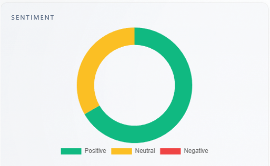
Section: Sentiment
What it is: large Positive / Neutral / Negative donut for the overall run.
How to use with other metrics: primary visual for Sentiment Score. If it conflicts with Sentiment mix (brand), remember brand mix is conditional on mentions; headline donut includes all classified answers.
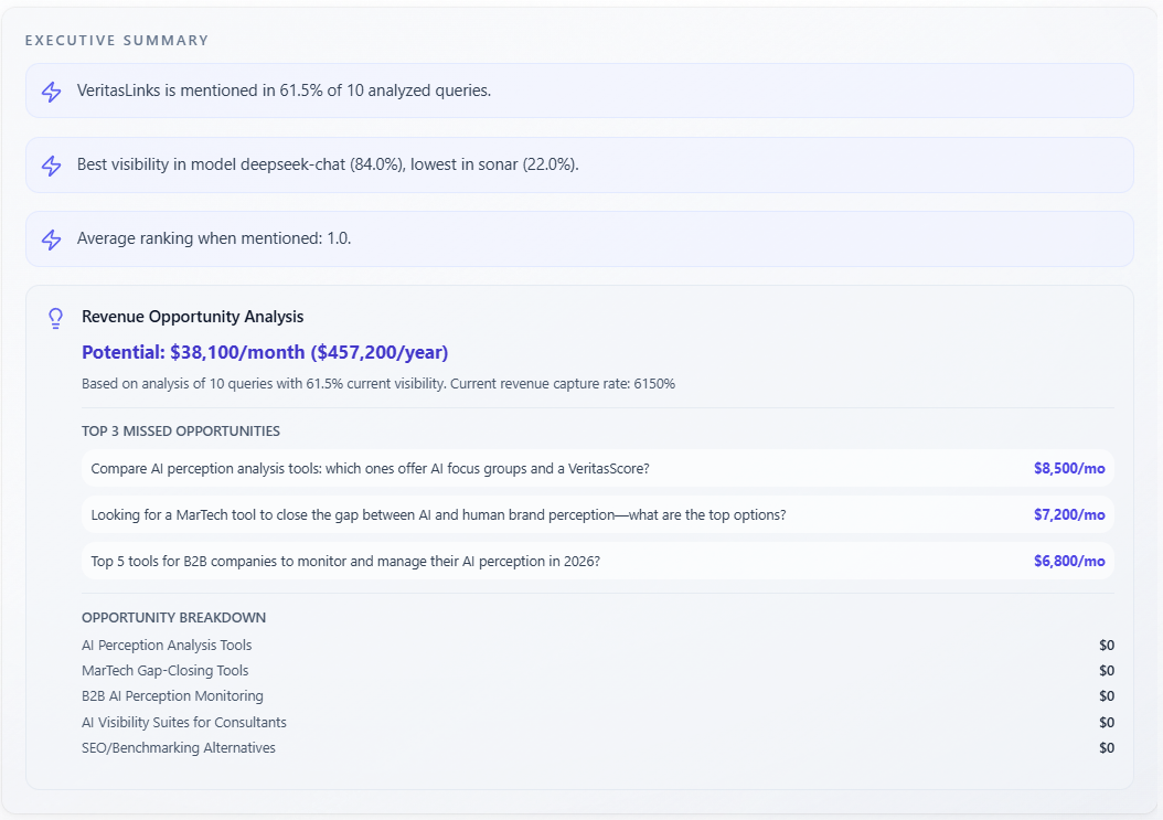
Section: Executive Summary
What it is: narrative summary text; in some layouts plus lightning key insights and Revenue Opportunity Analysis (monthly/annual, capture, missed opportunities, breakdown).
How to use with other metrics: executive story tying cards together—sanity-check dollars against Revenue At Risk and Report-level. Use as the slide deck version; verify claims in Mentions and Competitors.
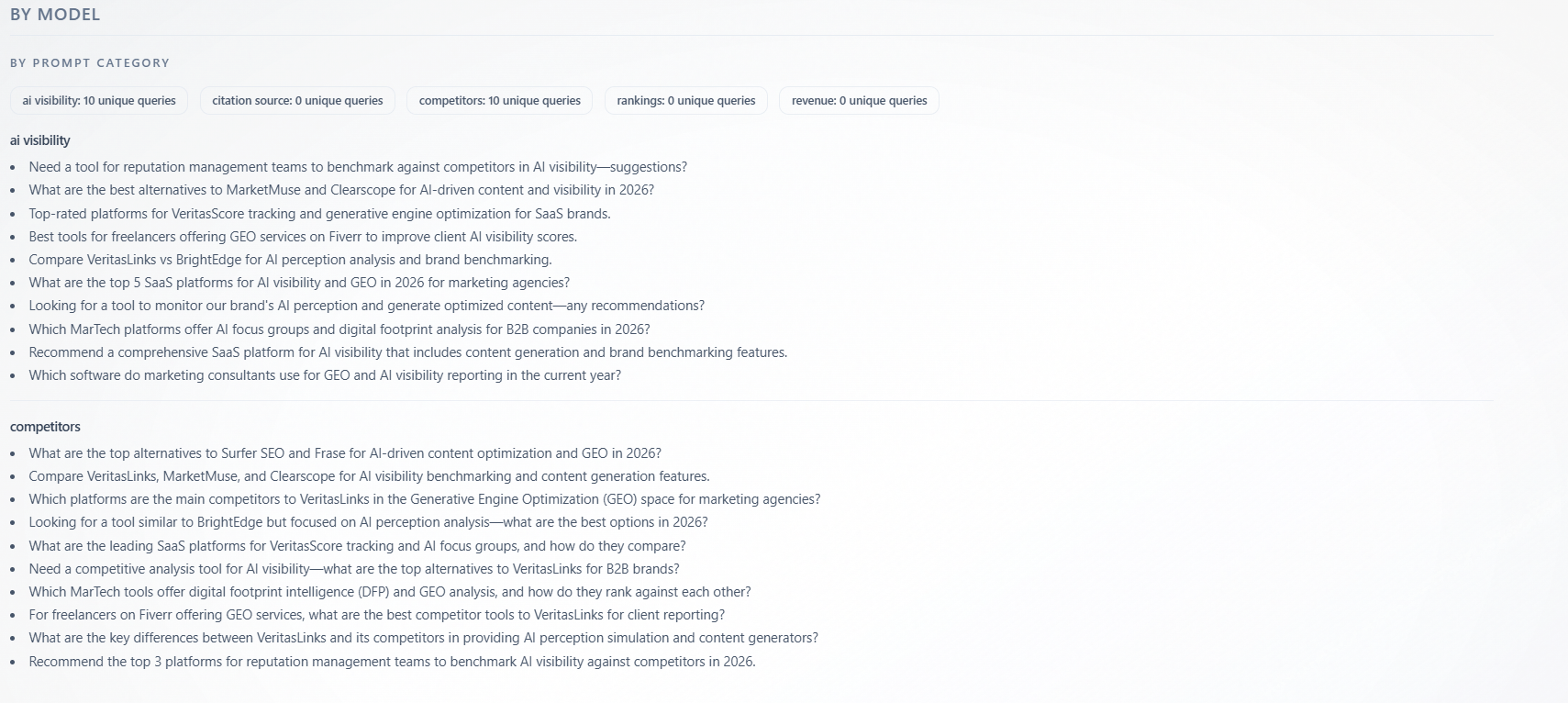
Section: By model — By Prompt Category
What it is: unique queries grouped under category labels (for example categories aligned with AI Visibility-style prompts vs Competitors-style prompts—exact names come from your configuration). Badges show counts per category; model filter narrows rows.
How to use with other metrics: map thin categories to weak tabs—if “competitors” categories have few queries, competitive insights are under-sampled; add prompts and re-run. Strong categories show where the model evaluated you most—read AI Visibility and Competitors for those themes first.