GEO report: Rankings
The Rankings tab turns answers into position language: headline cards summarize this run, then a trend chart when history exists, a per-query table (optionally filtered by assistant), and platform-style rows from the rankings analyzer. Data comes from the same answer grid as other tabs plus the rankings section of the report. Place PNGs under public/images/docs/ using the keys below.
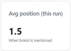
Indicator: Avg position (this run)
What it is: the arithmetic mean of every stored list position where the position is a positive number (zero or blank excluded). If none qualify, the app shows an em dash. This is a this-run snapshot, not a historical average across saved reports.
How to read it: lower is better (#1 is best). Compare to Top-3 share and Mention rate: a decent average with a low mention rate can mean you rank well only when you appear at all. Pair with Position by query to see which prompts drag the average up. The card subtext says “When brand is mentioned”; the average uses any row that has a stored positive rank when the model returned a ranked list.
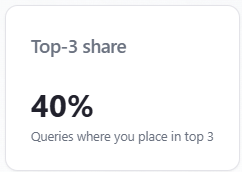
Indicator: Top-3 share
What it is: the percentage of answer rows (this run, all assistants combined when nothing is filtered) where you are mentioned and your position is between 1 and 3, divided by the total number of rows. It answers: “In how many answers did we both get mentioned and land in the top three slots?”
How to read it: stricter than Mention rate (you must be mentioned and placed in the top three). It is not deduplicated by unique prompt text—two assistants answering the same prompt count as two rows. A high Top-3 share with a low average position means you often make the shortlist with a strong slot; a low Top-3 share with high mention rate means you are named but usually ranked below #3 or without a numeric rank.
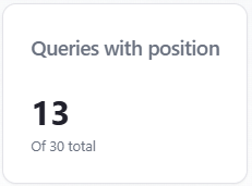
Indicator: Queries with position
What it is: a count of answer rows where a numeric list position exists and is greater than zero. The subtitle “Of N total” uses the row count from the answer grid when it is non-empty, otherwise overview totals so older reports still show a sensible denominator.
How it relates to Query Coverage (Overview / SOV): Query Coverage is the percentage of responses where your brand counts as mentioned. Queries with position counts how many rows received any numeric rank—not the same formula. Think of it as how often the assistant returned an ordered list that included a position for you. If N is large but the count is small, answers often lack a usable rank.
How to read it: divide mentally by “Of N total” to see what share of answers produced a position (not shown as a separate % card). Compare to Mention rate: if mentions are high but “queries with position” is low, you are often discussed without a clear #1–#N slot—improve list-style prompts or content that invites comparison.
Indicator: Mention rate
What it is: the same idea as on Overview: when the answer grid exists, mention count divided by total responses, rounded to a whole percent; when the grid is empty, values fall back to overview totals so the number matches the overview block.
How to read it: “were we named at all in this slice?” Pair with position metrics: mentioned but no rank suggests narrative presence without a shortlist; rank without mention should be rare—if combinations look odd, spot-check excerpts in Mentions Explorer.
Also documented
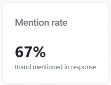
Table / chart: Position Trends
What it is: a line chart of average ranking position when listed over time. The chart needs at least two historical points with valid average position. The vertical axis is reversed so that position 1 is at the top; the chart is scaled roughly 1–10, so moving up on the chart means a better numeric rank.
Fallback: if stored history is thin, the report may show an alternate series from saved rankings data when that series looks like real per-run data (not placeholder week/month labels).
How to read it: use the line to see whether your typical position when ranked is improving across saved reports. In an empty state, older runs may lack rank fields—new runs help. Subscription messaging may appear for automated cadence. This is not Google SERP ranking; it is modeled position inside AI answers.
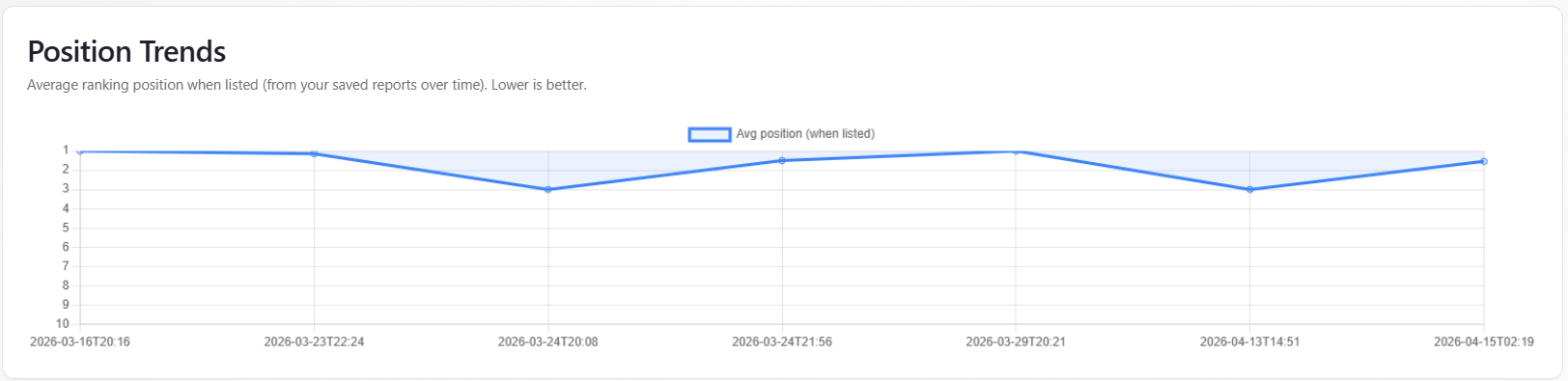
Table: Position by query
What it is: one row per unique prompt text for the current run. Rows are merged with a “best row wins” rule: prefer mentions, then better (lower) position. The table shows Query, Position (#n or —), Mentioned (Yes/No), and which assistant produced the row. Up to 50 unique prompts are listed; a footer notes when more exist.
By assistant: when you pick a single assistant in the By model section, the table only includes that assistant’s answers. When All is selected, the Model column can show different assistants for different prompts.
Switcher and plans: the By model header shows provider icons when more than one assistant appears in the report. On some trial plans, switching assistants may send you to subscription pricing; full multi-assistant comparison is available on eligible plans.
How to read it: sort mentally by business priority—fix high-intent prompts where you are “—” or far down first. Compare Model column when All is selected to see if one provider consistently ranks you lower.
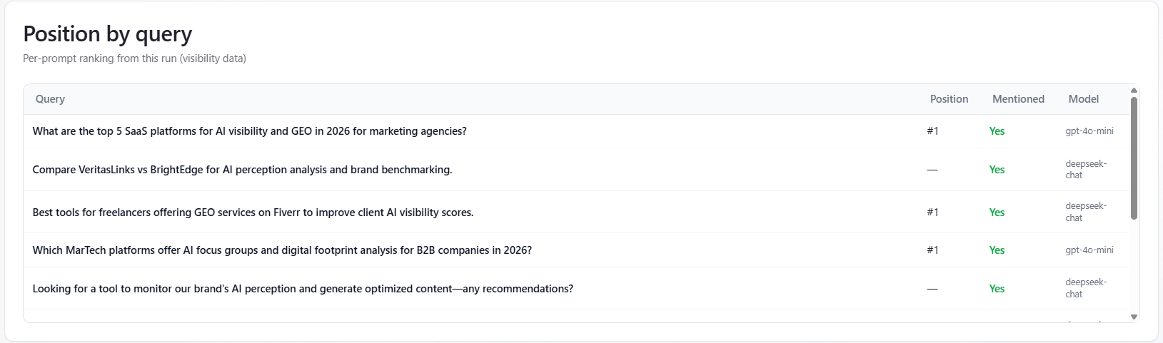
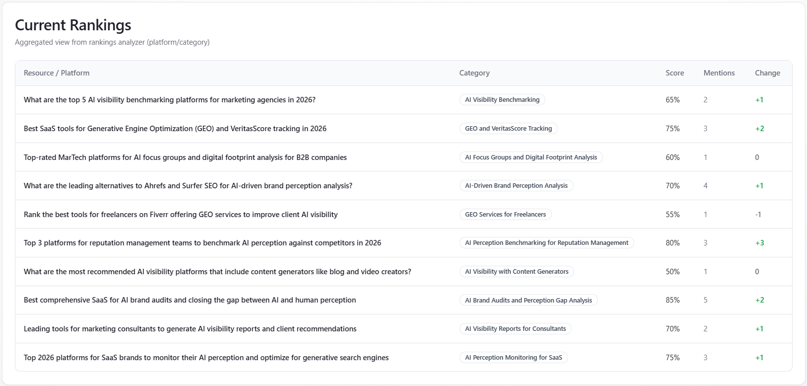
Table: Current Rankings
What it is: rows from the rankings-analyzer portion of the report—columns Resource / Platform, Category (badge), Score (%), Mentions, and Change (green styling when the change text includes a plus). This is aggregated, directional platform context from the analysis step, not a live keyword rank tracker.
How to read it: use it as supplemental context for how third-party or category lists might frame the space. If the table is empty, the analyzer returned no rows—more runs or different coverage may populate it; the in-app empty state suggests subscription for recurring runs.