Focus Groups: Overview tab — report sections
This page walks through every major block on the report’s Overview tab: what the label means, how to interpret the data, and a matching screenshot crop from a real session. Blocks appear only when the pipeline produced that content—short or older runs may omit some sections. Hero metrics (Confidence, Idea, history) are covered under Confidence & Idea scores.
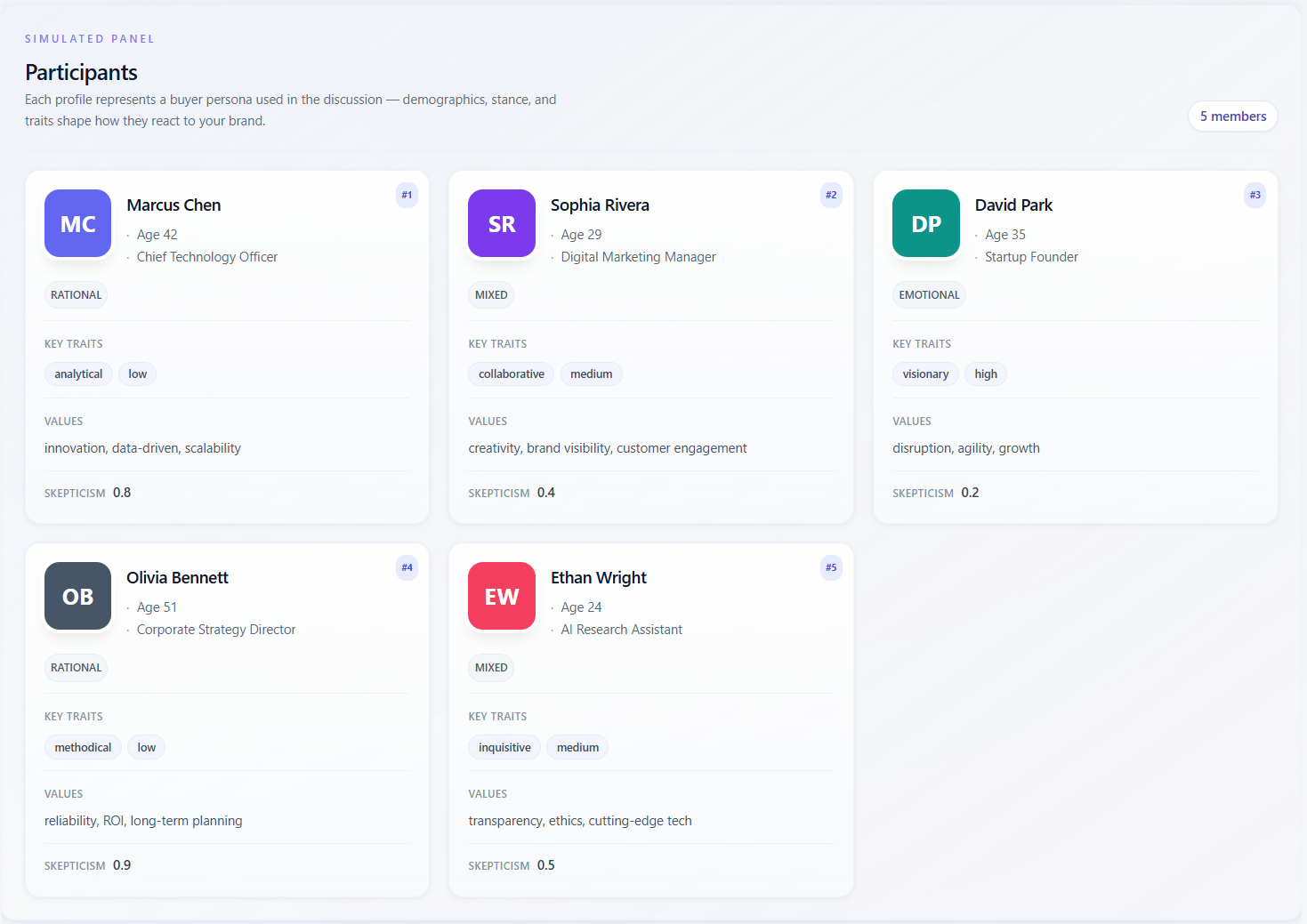
Simulated panel — Participants
What it means
The section labeled “Simulated panel” / “Participants” lists every buyer persona that took part in the discussion. Each card is a synthetic profile: name, demographics (e.g. age, occupation), decision style, behavioral traits, values, and sometimes a skepticism score. These are not real people—they are instructions to the model for how to argue and react.
How to read the data
- Use the cards to remember who is “in the room”: enterprise vs SMB, risk-averse vs early adopter, etc.—before you read scores or insights.
- Compare skepticism and traits across cards: a cluster of high-skepticism personas explains low aggregate scores; a single outlier persona explains divergence in “Per persona” ratings.
- Thin profiles (few traits, no values) suggest less nuance in the simulation—treat downstream scores as softer.
- Match persona labels to Discussion and Transcript turns when you need evidence for a claim.
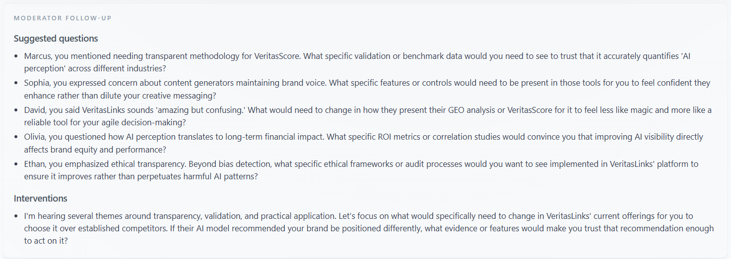
Moderator Follow-up
What it means
This block surfaces “Suggested questions” the moderator could ask in a follow-up session and, when present, “Interventions”—notes on where the discussion should be steered (clarify pricing, proof, objection handling, etc.). It is operational guidance for the next round, not a summary of what was said.
How to read the data
- Treat each suggested question as a hypothesis to validate with customers or in a re-run with an updated brief.
- If interventions dominate questions, the model thinks the panel did not resolve core blockers—check Discussion for the underlying debate.
- Use the list as a sales or CS script backlog: each line can become a discovery question or FAQ entry.
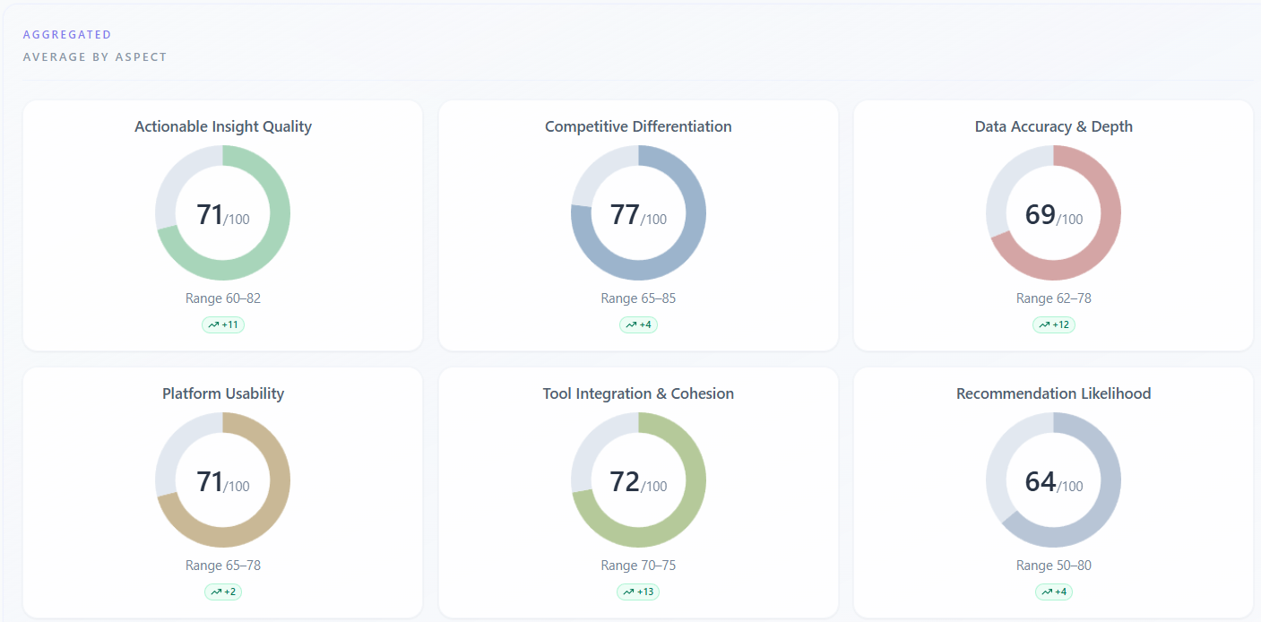
Scores — Aggregated — Average by aspect
What it means
Under “Scores” → “Participant Ratings”, the “Aggregated” / “Average by aspect” subsection shows one donut (or bar) per rating dimension (e.g. trust, clarity)—the panel average on a 0–100 scale, plus min–max spread across personas. NPS-style aspects may be stored separately and are not always shown here. A trend badge may compare the average to your previous session for the same company when history exists.
How to read the data
- High average with a wide min–max: the group disagrees—drill into “By participant” to see who drags the average.
- Narrow range with a mediocre average: consensus that the offer is “fine” but not exciting—prioritize proof or differentiation.
- Aspects with the lowest averages are your first levers for copy, product, or packaging; aspects already strong support messaging you can reuse.
- Small deltas vs “previous session” are noisy—trust the direction after you change something material, not single-point wiggles.
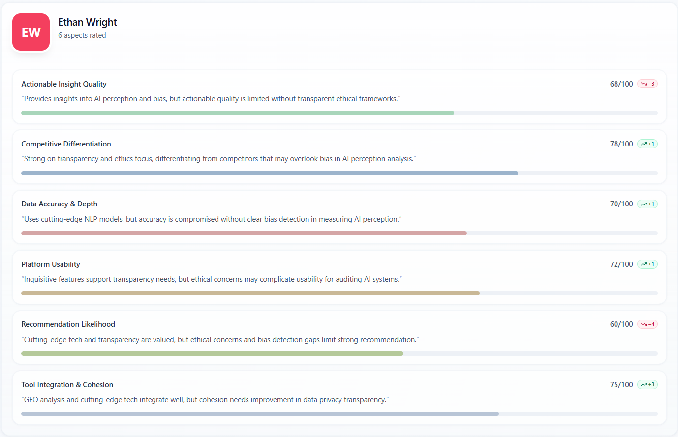
Scores — Per persona — By participant
What it means
The “Per persona” / “By participant” subsection repeats each rating dimension for each persona. You see the numeric score, a short quoted justification, a progress bar, and sometimes a badge comparing that persona to the panel average on that aspect.
How to read the data
- Read justifications as the model’s in-character reason, not a survey verbatim—use them to brief sales on likely objections by archetype.
- If one persona scores far below others on trust, that archetype is your risk segment; if one scores far above, that is your early-adopter profile for messaging tests.
- “No comment” means the engine did not store a rationale for that cell—rely on the score and transcript for that turn.
- Compare the same aspect across personas to see product–market fit by segment without averaging away the split.
Key Themes
What it means
Key Themes on Overview is a row of short topic chips distilled from the whole session—headline motifs (pricing, onboarding, trust, competitors, etc.). On the Insights tab you may see a larger “Synthesis” treatment; on Overview the chips are a quick scan of what dominated the conversation.
How to read the data
- Many chips imply a wide discussion; one or two repeating ideas mean the panel kept circling the same issues.
- Cross-check vague chips (“quality”, “value”) against Discussion or Transcript so you know what people actually argued.
- If Key Themes is missing, the run did not emit a theme list—use Detailed Insights or Discussion instead.

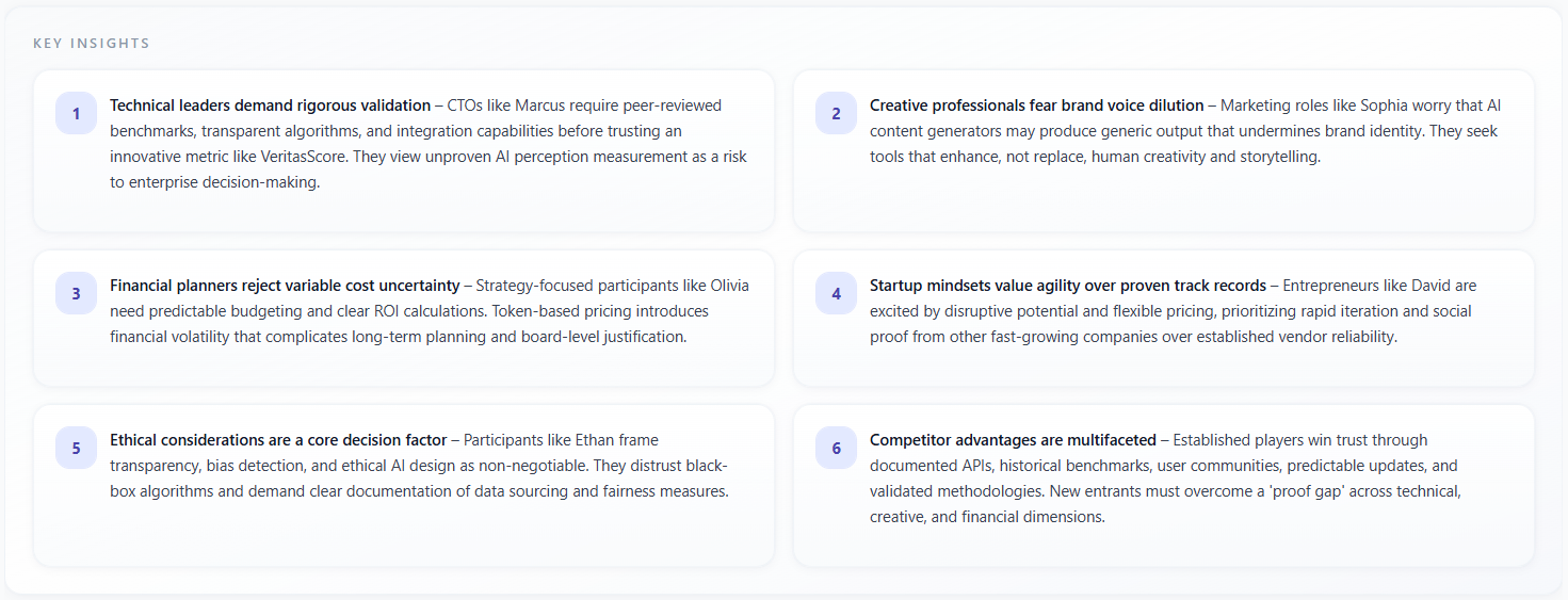
Key Insights
What it means
Key Insights is a grid of numbered cards (up to six on Overview) with narrative takeaways in prose—often markdown-formatted. Each card states a conclusion the model drew from the discussion, such as positioning risks, opportunity, or persona-specific reactions.
How to read the data
- Prioritize insights that you can tie to transcript moments; treat orphan claims as hypotheses.
- If two cards contradict each other, the session was split—resolve by persona-level ratings and Competitor choice (if applicable).
- Use the numbered order as a reading order, not a severity rank—re-rank by business impact for your roadmap.
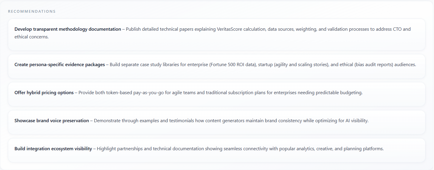
Recommendations
What it means
Recommendations are actionable bullets or short paragraphs—what to change in messaging, product proof, or next steps. They are generated as a backlog from the same session context as Key Insights, oriented toward execution.
How to read the data
- Batch recommendations by owner (web, product, sales) and by feasibility—quick wins vs research bets.
- Cross-reference with Persuasion Gaps and Moderator Follow-up: recommendations should close gaps the report already named.
- Re-run the focus group after implementing the top items to see if Confidence, Idea, and aspect scores move.
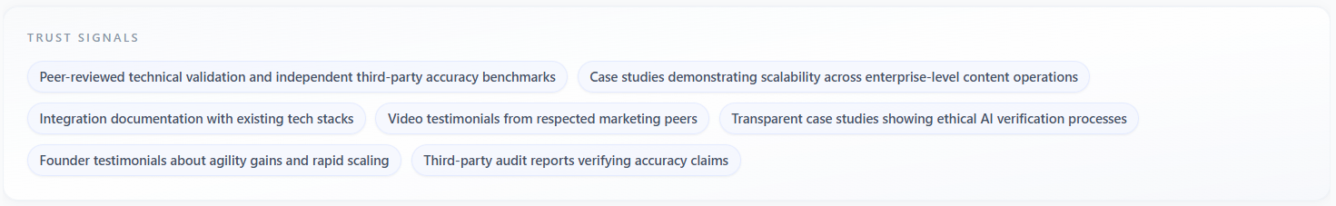
Trust Signals
What it means
Trust Signals lists phrases or labels for what would increase credibility for this panel—certifications, social proof, guarantees, transparent pricing, named customers, etc. It is displayed as chips, similar in density to Key Themes but focused on trust-building levers.
How to read the data
- Treat each chip as a testable asset: add it to the site or deck and re-run to see if trust-related scores rise.
- If Trust Signals overlap heavily with Persuasion Gaps, the panel is telling you “we might believe you if you proved X.”
- Empty or generic signals suggest the model did not find strong trust hooks—strengthen proof points manually.
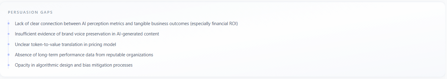
Persuasion Gaps
What it means
Persuasion Gaps is a vertical list (bulleted with accent markers) of where the story failed to persuade—missing evidence, unclear differentiation, pricing friction, category doubt, or mismatch with persona priorities. It names the gap in plain language so you can fix the narrative or the product story.
How to read the data
- Order is not always severity-sorted—rank by revenue impact and by how often the same gap appears in Discussion.
- Each gap should map to one recommendation or one FAQ; avoid duplicating work if Key Insights already said the same thing.
- If gaps are numerous, narrow the next brief and re-run rather than trying to fix everything at once.