Focus Groups: Insights
The Insights tab in the report is built from structured fields saved after the session (themes, consensus rows, narrative insight cards, triggers, objections). Blocks appear only when the pipeline produced that data—an older or shorter run may omit some sections.
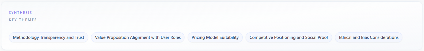
Synthesis: Key Themes
Label in the UI: small heading “Synthesis” and title “Key Themes”. This is a chip cloud of high-level topics the model distilled from the whole discussion—short phrases you can scan in seconds.
What it means
Each chip is a recurring motif (pricing, trust, onboarding, “vs competitor X”, etc.). It is a summary label, not a full argument. Several chips may overlap in meaning; treat them as a brainstorming wall, not a mutually exclusive taxonomy.
How to read the data
- Count and breadth: many diverse chips suggest a wide conversation; one or two chips dominating mean the session kept circling the same issues.
- Concrete vs vague: prefer chips you can tie to transcript moments. If a chip is generic (“quality”), open Discussion or Transcript to see what people actually said.
- Absence: if Key Themes is missing, the engine did not extract a theme list—rely on Detailed Insights and Objections for that run.
How to use it
Turn chips into a messaging map: for each theme, decide “own it”, “neutralize it”, or “avoid claiming it until we have proof”. Prioritize themes that also appear under Objections or with low agreement in Consensus by Theme.
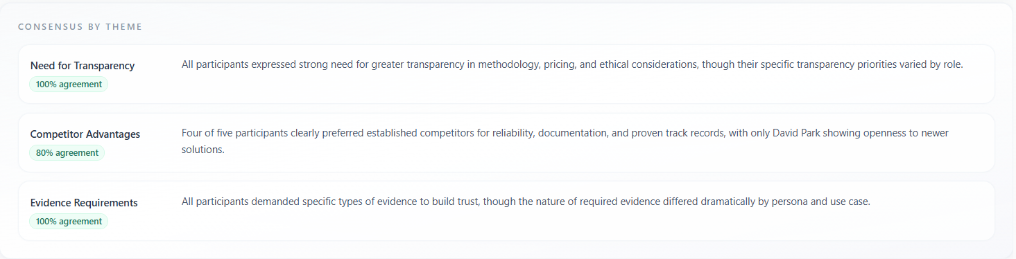
Consensus by Theme
A list of cards: each row is one theme title, often an “agreement %” badge, and a short summary paragraph. It answers: “Where did most personas land on the same conclusion?”
What it means
High agreement means the panel converged on a shared read of that theme (e.g. everyone finds the pricing fair). Lower agreement still listed here means the theme was important but the summary captures the majority or blended view—pair with Divergent Themes for tension.
How to read the data
- Agreement percentage: treat as a directional signal of alignment in the simulation, not a statistical survey margin. Use it to sort which themes are “safe” to broadcast.
- Summary text: read for who benefits and who bears risk (buyer vs vendor). If the summary hedges, the underlying quotes were mixed.
- Order: earlier rows are not always more important than later ones—use agreement level and your business priority to rank.
How to use it
Consensus rows are strong inputs for homepage claims, sales talk tracks, and FAQ: they tell you what you can say publicly with lower risk of immediate pushback—still validate with real customers for high-stakes launches.
Divergent Themes
Shown as highlighted chips (often amber styling). These are themes where personas disagreed, held incompatible preferences, or pulled the discussion in different directions.
What it means
Divergence is valuable: it exposes segmentation, political/internal trade-offs, or messaging that works for one buyer profile but alienates another. It is not automatically “bad”—it is where positioning choices live.
How to read the data
- Cross-check each divergent chip against Consensus by Theme: if “security” is high consensus but “cloud vs on-prem” is divergent, you have a channel or segment split, not a generic security problem.
- If a divergent theme is a single edge-case persona, consider whether the persona mix should change on the next run rather than changing the whole product story.
How to use it
Produce variant messaging: landing page A vs B, enterprise vs mid-market decks, or optional modules. Feed divergent themes into sales discovery questions (“Which camp is the buyer in?”).

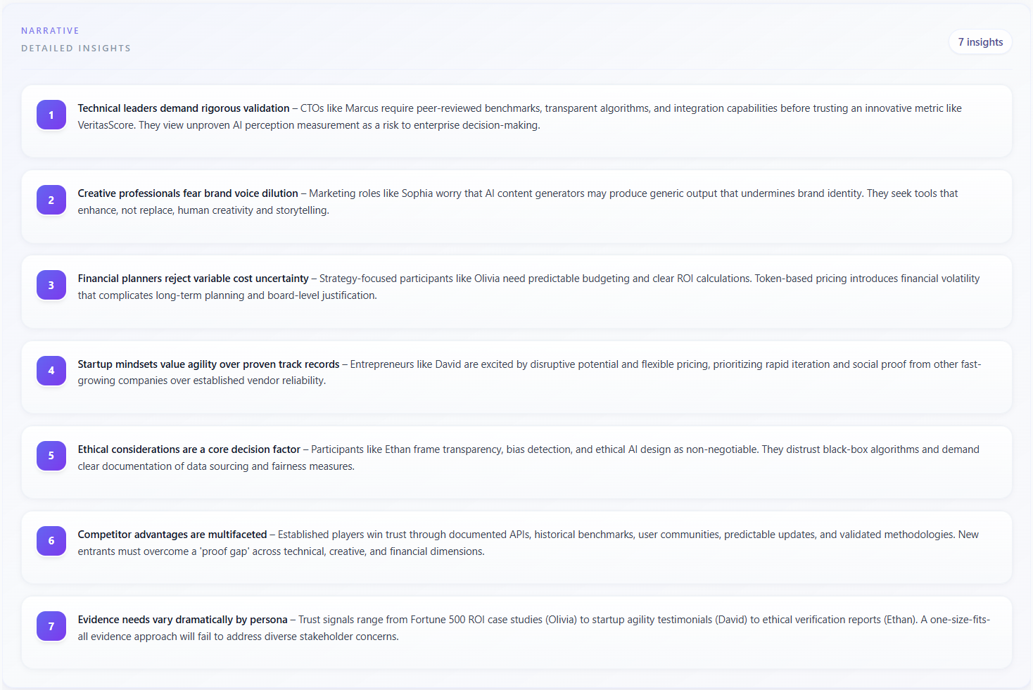
Narrative: Detailed Insights
Label in the UI: “Narrative” and “Detailed Insights”. Numbered cards with longer prose (Markdown). This is the richest textual synthesis of the session—story-level takeaways rather than single-word chips.
What it means
Each card is an independent insight paragraph the model judged worth surfacing (value props, risks, opportunities, competitive angles). The counter shows how many insight cards exist for the session.
How to read the data
- Read in order first for narrative flow; then reorder mentally by business impact.
- If content is locked behind a paywall in the product, the same structure applies once unlocked—cards are the primary export-worthy content.
- Watch for duplicates or near-duplicates: merge them mentally into one initiative to avoid double-counting work.
How to use it
Turn each card into a hypothesis or backlog item (copy test, pricing experiment, proof asset, onboarding change). Link cards to GEO tabs when the same claim appears in model answers and in the panel (e.g. trust, integrations).
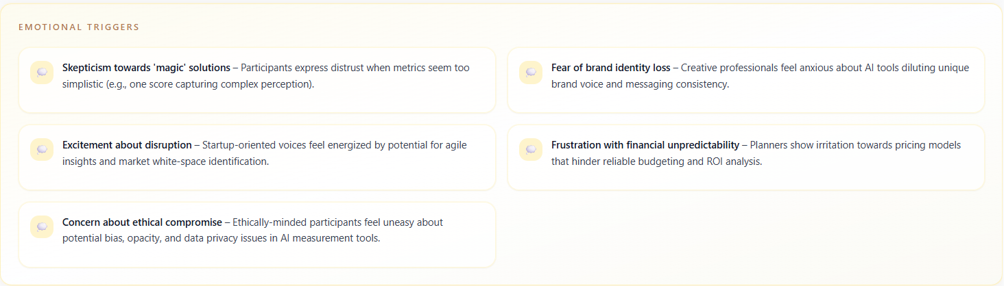
Emotional Triggers
A dedicated block (amber styling) listing phrases or situations that reliably aroused strong feelings—enthusiasm, fear, frustration, urgency. Each item is usually a short paragraph in a grid.
What it means
Triggers are levers for creative and demand gen: they show what language or stakes made personas lean in or pull back. They are not clinical psychology diagnoses; they are simulation-derived hooks and landmines.
How to read the data
- Positive triggers: candidate headlines, ad angles, or community stories.
- Negative triggers: words to avoid in cold outreach, or topics that need a softer setup and proof before you lead with them.
- Intensity is implied by wording, not a separate score—compare trigger count and placement across runs after you change messaging.
How to use it
Give triggers to copywriters and SDRs as “say this / never lead with this” lists. Pair with Objections when the same trigger appears as both excitement and fear (ambivalence).
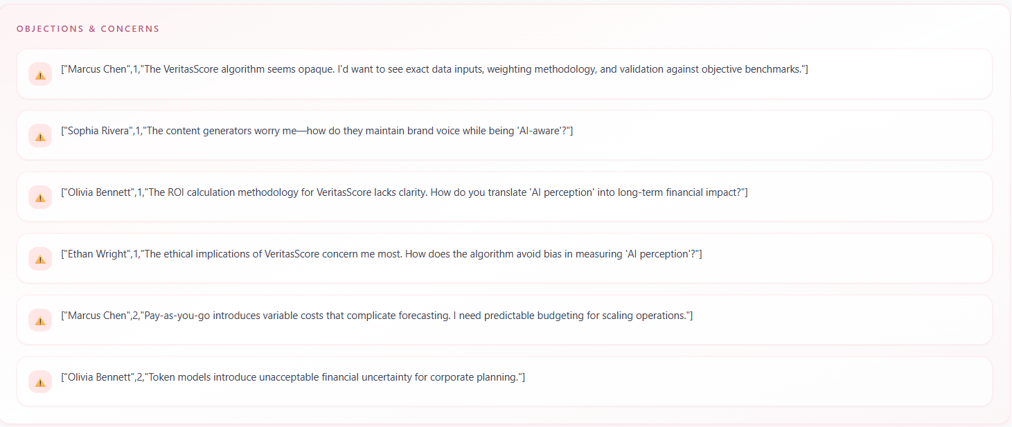
Objections & Concerns
A rose-styled list of objection cards. Each card states the concern; some rows also show metadata such as which persona raised it and in which round—when the backend provided those fields.
What it means
These are explicit pushbacks or worry statements, stronger than a “risk theme” chip. They are the closest analogue to a real discovery call list of blockers.
How to read the data
- Who / Round: use to see if an objection is one persona’s idiosyncrasy vs a pattern repeated across rounds.
- Severity: long, specific objections usually outweigh short generic ones when prioritizing fixes.
- Overlap with Emotional Triggers: if the same topic appears in both, design content that acknowledges the feeling before handling the logical objection.
How to use it
Route objections to owners: product (if feature gap), legal (if compliance), marketing (if perception), CS (if onboarding). Re-run the session after fixes to see if the same objection text disappears.
How the tab fits together
Work top-down: Key Themes for scan → Consensus vs Divergent for strategy split → Detailed Insights for narrative → Emotional Triggers and Objections for messaging and product risk. Cross-read with the Risks tab when you need severity ordering.